
Most marketers would say they know a bad website when they see one. The crazy fonts, cluttered layouts, and outdated animations are dead giveaways. And yet, we continually see surveys – like this one from Nielson – that show us how lots of organizations keep frustrating online visitors.
Note that I’m not talking about obvious errors like non-responsive design, slow web hosting, or broken links. Instead, I’m referring to the less obvious blunders that are easier to miss. After all, that’s why they are so common in the first place.
To give you a sense of what you should look out for when designing a website, here are four annoying web design mistakes that drive customers away…
#1 Hiding Your Content
The percentage of visitors who come to your website because they have absolutely nothing else to do with their time is probably a lot lower than you might imagine. And so, it’s important to remember that the rest of your potential customers are looking to find information quickly and efficiently.
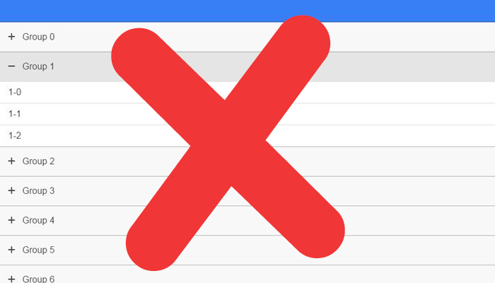
That’s difficult to do if you seem to be hiding your content. It’s not unusual for us to come across websites that seem well laid out until you begin digging into the details. At that point, you find there is confusing navigation, overlapping pages (with headings like “what we do” right next to “services”), and site maps that go three or four layers deep. The same goes with underpowered search features and hidden content. These are frustrating for visitors at best.
SEO tip: Google ignores hidden content in sliders, accordions, and tabs. If it's hidden from view, it can't really be that important, now can it?
How is any of that going to help someone who needs a product or service? Assuming they came to your site because they actually needed something, you want it to be as simple as possible for them to find it.
#2 Leaving Visitors Stuck at Dead Ends
No one likes to be stranded, whether it’s during a country drive, a long airport layover, or a visit to a potential vendor’s website. Dead ends tell customers to take their attention and business elsewhere.
Of course, marketers never think of any page in a website as being a stopping point. But, that’s the way they can feel to prospects who are looking for one resource or answer and are delivered to another without any way to go back. Opening content in a new window, sending them to a page with no obvious next step, or failing to make internal links obvious are all ways of stranding visitors on your site.
One of the easiest ways to make your online presence more usable is to simply study visitor behavior and ask yourself “where would a person want to go from here?” Or, “if someone ended up on this page by accident, how could they get to the answer they need? By thinking through your content and navigation structure in that way, you can avoid online dead ends.
#3 Ignoring the Big Questions
As a business owner or executive, you are probably familiar with this dilemma: you want to give potential buyers information because that’s what they crave, but you also don’t want to give them so much that they leave before they have given you some information or seeing the value of what you have to offer.
There’s not always a clear answer, but you shouldn’t leave big questions about price and availability hanging in a visitor’s mind. In the Nielsen survey, researchers saw several websites that required users to open an account before they could find out how much the service they wanted would cost. It’s not hard to see how that would frustrate an actual buyer who would want to know if they can afford what’s on sale before making a commitment.
Besides, withholding important information is bad business for another reason, too. When prospects can't figure out the details of what you have, they can’t determine whether you’re a good fit for their needs. That means you could end up with lots of inquiries that waste your time without leading to real sales opportunities.
#4 Useless Features and Information Overkill
Some businesses (and web designers) seem more interested about showing what they can do online than thinking about what they should do. They take a kitchen sink approach to development that overwhelms visitors and obscures the real value of what they have to offer.
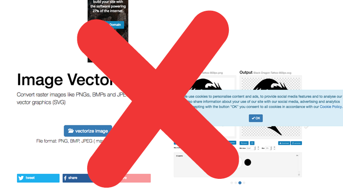
If your website is overly-reliant on filters, apps, and plug-ins that don’t add anything to the user experience but make your site more complex, then why not take them away? They aren’t going to do customers any favors, but may cause your pages to load slowly or create conflicts between various pieces of coding that weren’t written to operate together.
The same goes for huge blocks of text that offer information no one really wants or needs. These can be edited down, or separated into different sections that are easier to scan and comprehend. The bottom line is you shouldn’t add anything to your website unless it has a very specific purpose. Visitors are coming to your pages to learn about your business, not to see how many distractions you can fit into a single layout or read obscure information that makes it harder to find the right decision.
It’s All About Your Visitor
Although I’ve listed out four different mistakes here, the fact of the matter is they all stem from one common problem: failing to put your users and potential customers first. When you consider their needs, and go out of your way to give them a positive experience, a lot of these issues go away on their own. It’s typically when businesses move into “marketing and conversion” mode that they end up with isolated content, hidden answers, and information overload.
Putting the people who do business with you at the front of your thoughts and inspirations is a great way to make your business successful, online or off. Have you forgotten that and made one of these web design mistakes recently? We can help you fix that.

