Your small business's website serves as THE online touchpoint for many prospects. Done right, it can showcase what you do and drive conversions. One aspect that can significantly impact your website's success is user experience. And within user experience, is your site's navigation approach.
By selecting the right navigation type, you can create an intuitive and seamless browsing experience. In this article, we're exploring different types of navigation and their use cases. While our focus today is on small business websites, the same principles apply to larger sites.
1. Horizontal Navigation
 Horizontal navigation is ideal for small business websites that prioritize simplicity and straightforward access to different sections. Websites looking to categorize content into sections like Services, Products, and About can easily organize their website using (standard) horizontal navigation. One common error people make is adding too many things to their navigation, which serves to confuse rather than guide. Consider primary topic pages for your main NAV and put links to related pages within the page. If you've read my book "the art of flowww" which outlines matching link types to the buyer's journey, you'll recognize main menus and side-bars as "contextual" navigation types.

2. Vertical/Side Navigation
When it comes to content-heavy websites such as blogs or applications with extensive features, vertical navigation can provide a space-efficient way to display categories and recent posts. Businesses focusing on delivering educational content or industry insights can make good use of vertical navigation to help users navigate through the depth of the information they have available.
3. Dropdown Menu
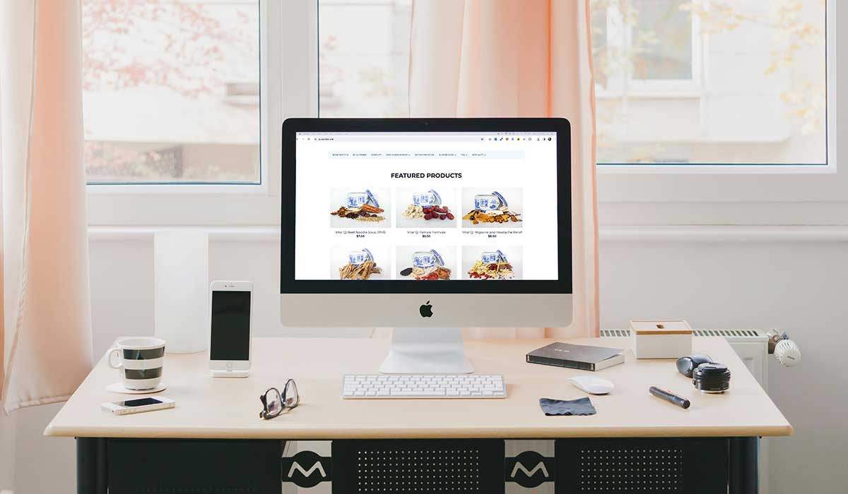
For eCommerce websites (like the one shown in the featured image) with a wide range of product categories and subcategories, dropdown menus offer a structured and organized way to present product navigation options. Small businesses selling products online can leverage dropdown menus to streamline the shopping experience and help customers find what they're looking for quickly.
4. Hamburger Menu
Mobile menus were made for limited screen space and are most common there. I've seen and used 'Hamburger menus" on desktop websites as well...to discover that people don't really click them open unless very interested. My advice: go ahead and include a hamburger menu on desktop, just accompany it with a few standard horizontal visible menu words to attract use.
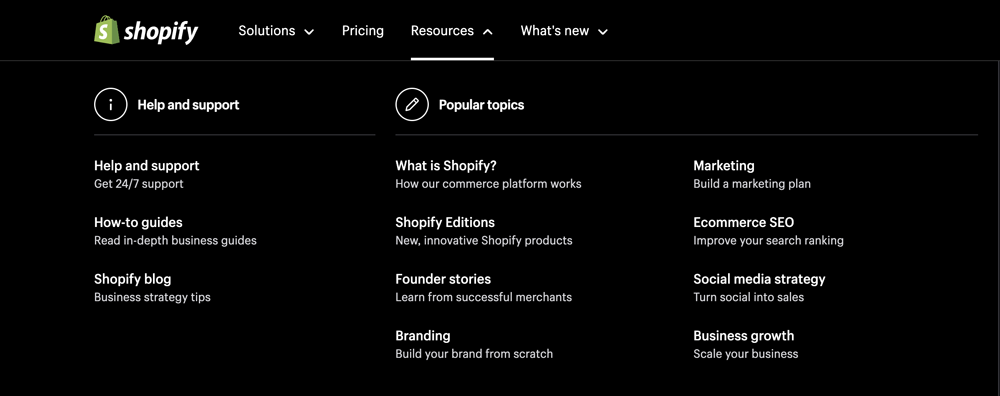
5. Mega Menu
Websites with a diverse range of products or topics, would be smart to leverage mega menus to display an array of items at a glance. Retailers and manufacturers especially should use these.
6. Breadcrumb Navigation
Breadcrumbs are those tiny "back" links once quite popular on desktop websites. Today, these are more appropriately used to display a user's current location within a course (for example) as it helps them track progress, sometimes providing a way to navigate back to previous sections.
7. Tabbed and Accordion Navigation
Once quite popular, accordions and tabs would segment different aspects of a product or service. However, using these means that some or most of your content is hidden from search engines (and visitors) which is a no-no. So, implement these types of navigation with caution.
8. Widgets Navigation
A great place for commonly used links. Can be an expanded version of your main navigation. Plus, it can include a blog roll, photos, and even map embeds.
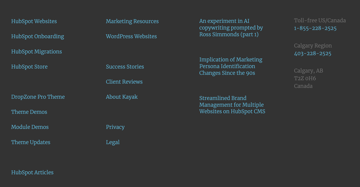
9. Footer Navigation
Footer navigation usually appears site-wide. It's perfect for displaying important links to company details, such as legal pages and location information. The part about these being site-wide impacts your SEO. Search engines pay close attention to these types of links and score your website accordingly. Less is more. Quality is important.
Implementing the best navigation type for your website enhances visitor experience, improves navigation efficiency, and drives engagement. By understanding the unique characteristics of each nav type, you can create a seamless, user-friendly browsing experience. The key to a successful website lies in meeting the needs and preferences of your users, by providing an intuitive and effective way to discover, buy, and make contact.
